
Eraser map app
The back story
Eraser map was conceptualized as being the reference application for the SDKs for our services on Android. Over the year that we spent building and testing it, we saw the address data in search, the road network in navigation, and the details of the map improving. Much yay for the open data community!!
In the process of testing, we heard our users mention how they were wary of all the navigation apps collecting their private location data at all times. As we saw open data quality improve, we wondered if we could use our SDKs to build a mobile mapping application that could make the same promise as DuckDuckGo: not to log or track our users, at a time when user privacy is a major concern. Since Mapzen runs its own map stack and is not dependent on third-party mapping providers, we can follow through on promises we make about how we handle user data.
For design, this gave me the opportunity to think through all the interactions and question the norm (aka Google Maps).
Cartography
We began by looking at our data and building layers to form a digital presentation of the real world. We developed our graphics rendering engine as we massaged the data - density and quality, that should display on the map at various zoom levels.
Color considerations
We played with a variety of color options for the route line to make sure it was clear and visible in different lighting conditions and worked for users with color vision deficiencies.
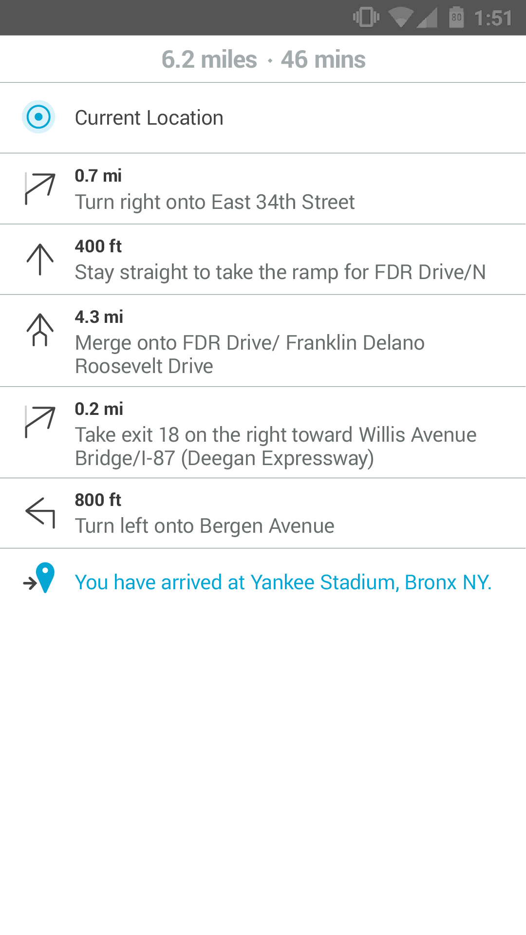
Text directions
Reading while driving is not easy apart from being a safety risk. The screen is at least 24inches+ away from you and at higher speeds there is usually just glancing and not reading. So, using icons and symbols where possible on the main screen but also a more verbose list of directions for the passenger was important.
Also, some drivers prefer text only directions, some like the combination of text and audio and if you're like me, you like to look around at the physical environment and only follow audio cues. The displayed directions on screen had to work for all types of drivers and the layout had to be scalable to account for different languages.
Iconography
Flow wireframes
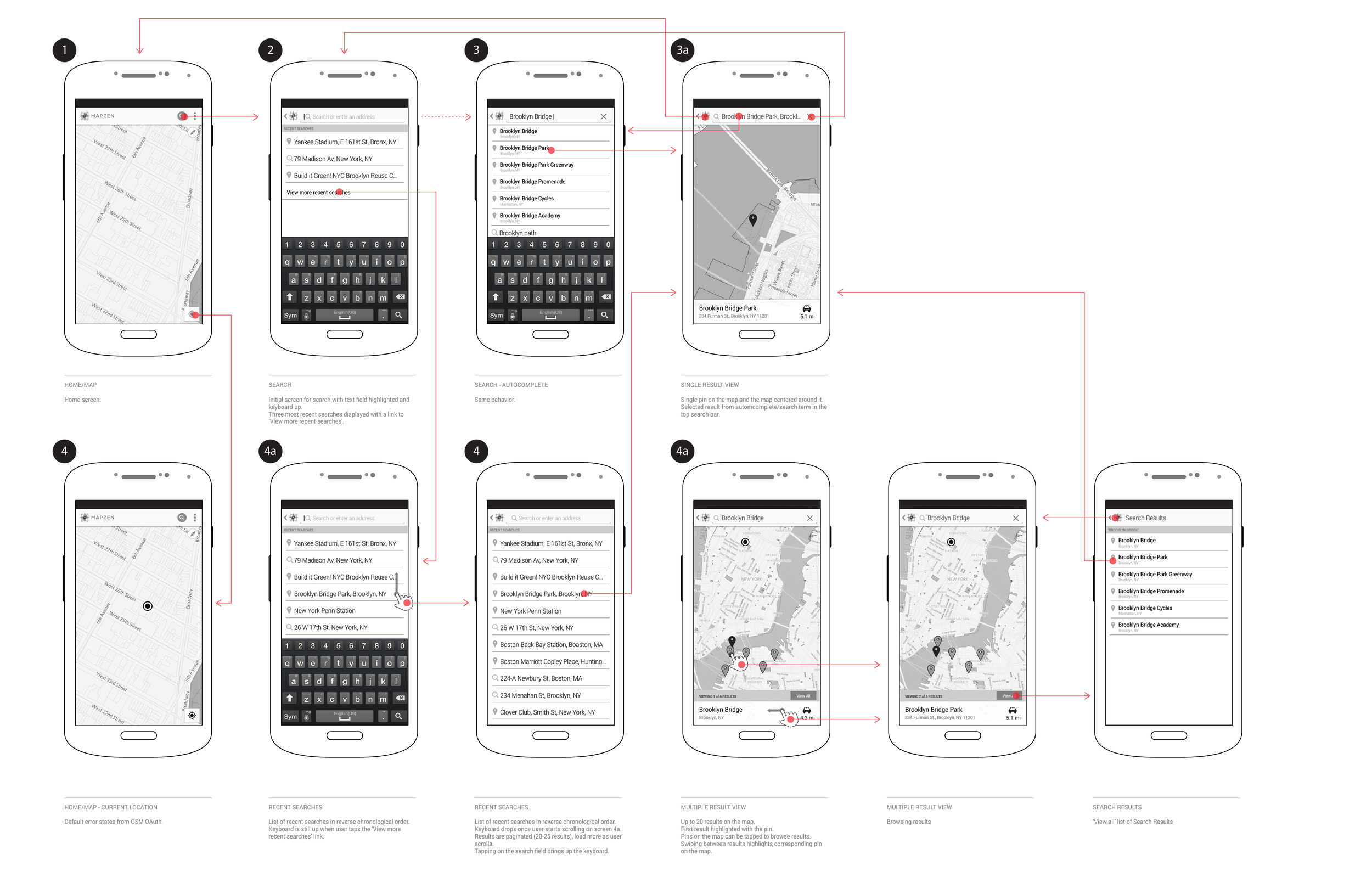
Search flow

Navigation flow (version 1 - driving only)
visual Design directions
Then it was time to put it all together!
Direction 1
Direction 2
Final designs


In October 2017, I gave a talk about the UX of navigation apps and I highlighted key screens in a navigation flow for driving and share all the thinking that goes into presenting the UI to the driver.
Logo explorations
Role - Wireframing and Prototyping, Usability testing, Interface design, Logo and icon design
